9 July 2021 | Ted Page
Text set in all caps can be problematical from an accessibility perspective. However, if you use styles correctly in InDesign or Microsoft Word, many of the problems can be avoided.
Wikipedia defines all caps as follows: “In typography, all caps (short for ‘all capitals’) refers to text or a font in which all letters are capital letters, for example: TEXT IN ALL CAPS … They are commonly seen in legal documents, the titles on book covers, in advertisements and in newspaper headlines.”
They are also commonly used for headings in annual reports and other large documents.
Problems for assistive technology users
All caps text can cause problems for assistive technology users because words can sometimes be mistaken for abbreviations. For example, the “US” in “CONTACT US” will be read as if it were the abbreviation of “United States” by most major assistive technologies including JAWS and NVDA (screen readers), Read&Write Gold and Claro Read (literacy software) and Zoom Text Magnifier/Reader.
Legibility
Poor legibility affects many different people but is disproportionately problematical for people with low vision or dyslexia.
There is no real dispute that text set in all caps is slower and more difficult to read than text set in sentence case, although the reasons for this may still be controversial. Some argue that part of our ability to recognize words comes from the shape of those words which is lost in all caps. Others argue that it is simply a practice effect—if we were to read all caps text for long enough, we would eventually get up to speed with it. (For more on this debate see Kevin Larson, The science of word recognition.)
Tables of contents and bookmarks
In PDFs, headings have a secondary function which is to generate tables of contents and bookmarks for navigation. If document authors create their headings by typing upper case letters directly into the document, then the table of contents and bookmarks will also be generated in all caps, as seen below.

Compare the above, in terms of legibility, with the sentence case version below.

Using styles
Both problems can be avoided if authors type in sentence case and then convert to all caps using a style.
InDesign
To do so in InDesign, open the relevant paragraph style and select Basic Character Formats. From the Case dropdown, select All Caps. (Alternatively, you can use a font that has only upper case letters—the result will be the same.)
Authors might also want to consider increasing tracking by 10% or so to avoid the overly tight spacing commonly associated with all caps headings.
![]()
Microsoft Word
In Word, right-click the relevant style, select Modify, click the Format button and then select Font. From the Font dialogue box, under the Font tab, select All caps.

Alternatively, as previously, you can use a font that has only upper case letters, such as Felix Titling.
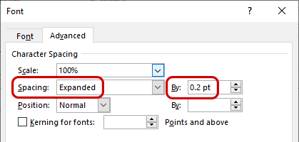
To set letter spacing (tracking) in Word, in the Font dialogue box select the Advanced tab. Set Spacing to Expanded and the amount required in the associated By field.
The result
Headings created in this way will of course appear (visually) in the document in all caps, but for assistive technologies, and in tables of contents and bookmarks, they will remain in sentence case, thus eliminating many of the problems traditionally associated with all caps text.