26 November 2019 | Ted Page
Summary
This post addresses the five areas that most commonly go wrong in the creation of accessible infographics for publication in PDFs. The issues are colour blindness; colour contrast; preserving text as real text; setting the reading order of content within infographics; and including appropriate alt text.
Colour blindness
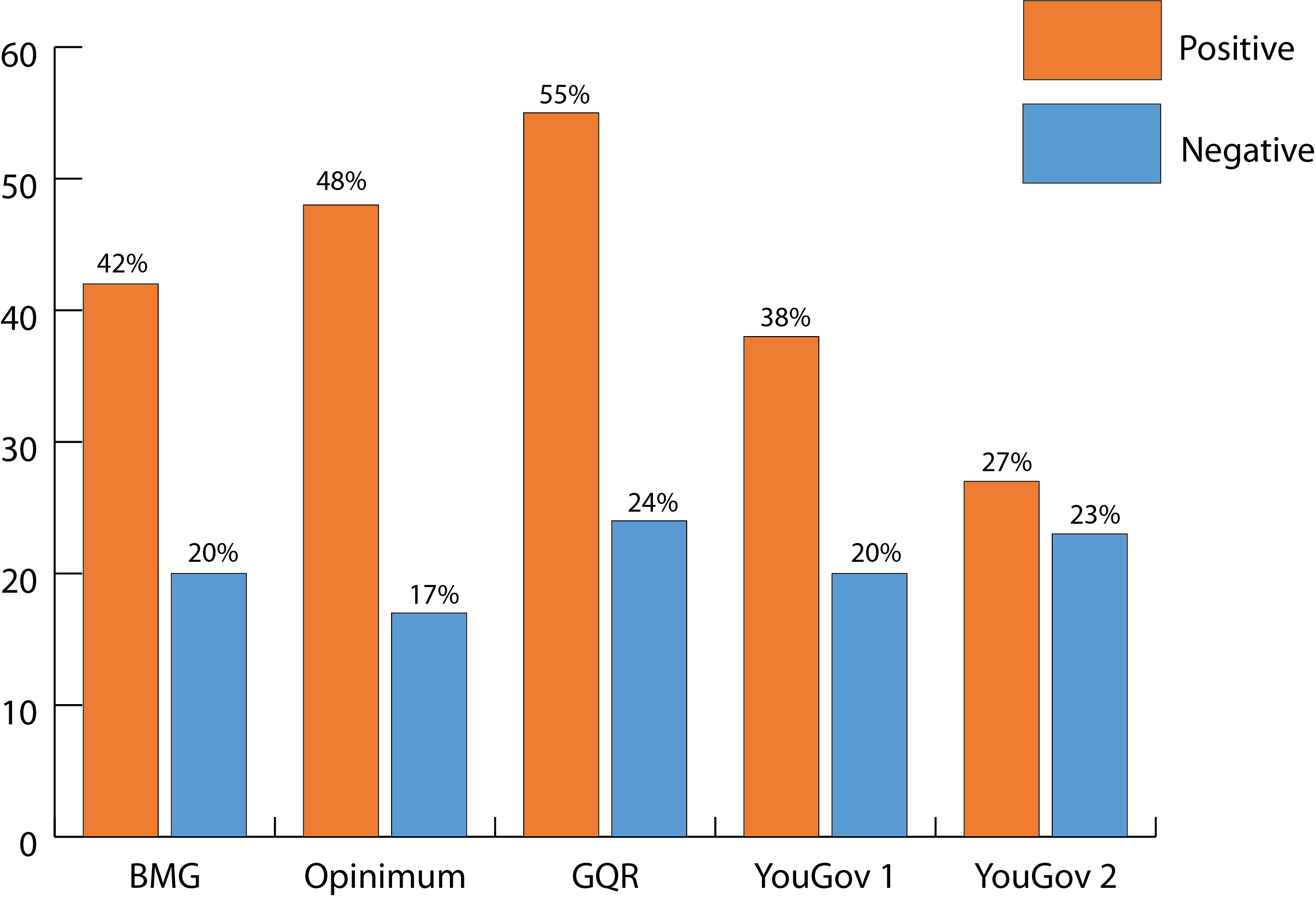
Firstly, let’s take a simple bar (column) chart such as the following.
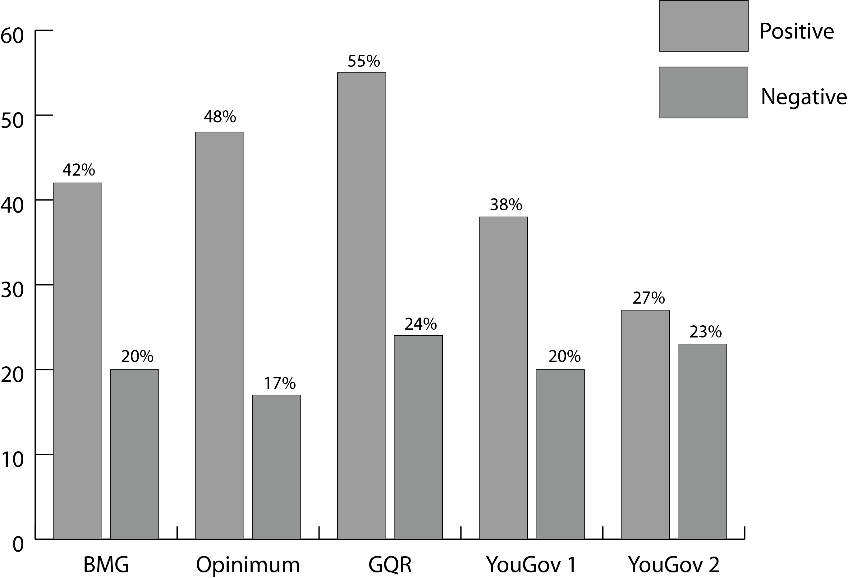
Adobe Illustrator includes tools to check infographics for the two most common forms of colour blindness—protanopia and deuteranopia. To do so, from the View menu, select Proof Setup and then Color blindness – Protanopia type (for red-blind colour blindness) or Color blindness – Deuteranopia type (for green-blind colour blindness). Choosing to simulate protanopia in this case will yield the following result.

Although, as we will see shortly, we are not off the hook yet with this graphic, the colour bars are easily distinguishable from each other in this test, as they also would be with the deuteranopia filter.
However, this is not always the case. Consider, for example, the following (unfiltered) map of the 2017 UK election result. Compare the colour differences between the orange of the Lib Dems in Westmorland and Lonsdale in the north west, or North Norfolk, with the dark red of the DUP in Northern Ireland, or the lighter red of Labour across the rest of the UK.
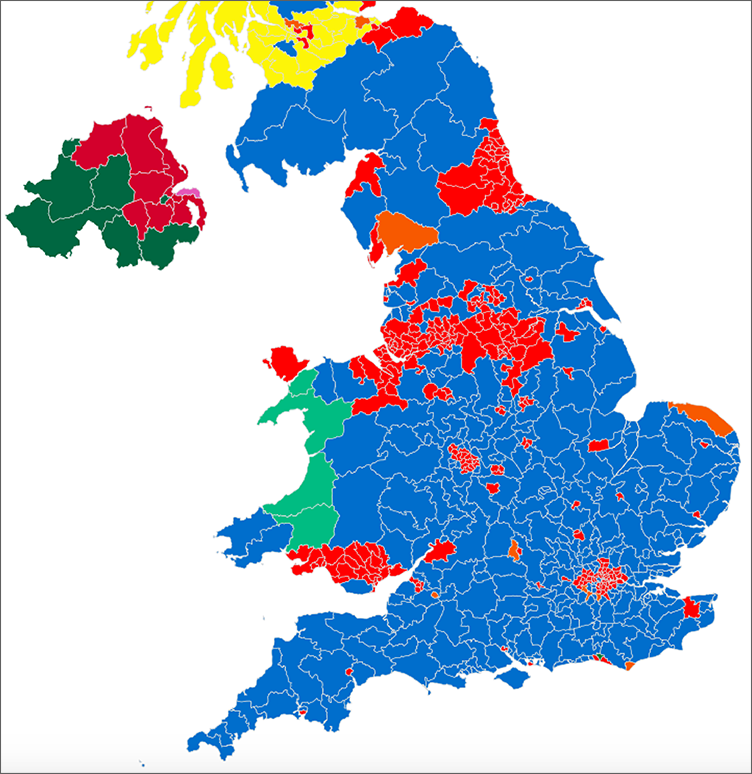
Now apply a deuteranopia filter, and the graphic will look like the following. Notice that constituencies previously indicated by the orange of the Lib Dems and the red of Labour are now effectively indistinguishable from each other, with the darker red of the DUP being not much better (spoiler alert—there’s worse to come).

Adobe’s guidance
On its Illustrator accessibility web page Adobe offers the following general guidance for using the Proof Setup tool:
- Convert the document to RGB color mode, which provides the most accurate soft proofs for color blindness
- If objects are difficult to distinguish in colour-blind proofs, change color brightness or hue:
- Pure red tends to appear dark and muddy; orange-red is easier to recognize
- Bluish green is less confusing than yellowish green
- Grey may be confused with magenta, pale pink, pale green, or emerald green
- Avoid the following combinations whenever possible: red and green; yellow and bright green; light blue and pink; dark blue and violet.
Other colour blindness simulators
Useful as the Illustrator Proof Setup tool is, it is also important to check infographics for other, not-so-common forms of colour blindness such as tritanopia (blue-blind colour blindness), or monochromacy (no colour vision).
For example, below is a version of the UK 2017 electoral map with a tritanopia filter across it, as seen in the Color Oracle colour blindness simulator (a free download, which unfortunately does not yet have a working Windows 10 version).

As can be seen, the constituencies previously indicated by the red of Labour and the darker red of the DUP are now completely indistinguishable from each other. And the orange of the Lib Dems is not much better.
Colour contrast
New in WCAG 2.1 is the requirement to provide sufficient contrast between adjacent areas of colour in diagrams. If you measure the contrast ratio between the orange and blue in the original bar chart above, you will find that it is just 1.1:1, which is far below the 3:1 minimum required by WCAG (SC 1.4.11).
The consequences of such poor contrast can perhaps be most starkly seen when this image is viewed in grayscale. To do so in Illustrator, from the View menu, select Proof Setup, Customize, and then from the Device to Simulate dropdown select sGray. Doing so will give the following result.
The most serious problems with this, of course, will be for those with no colour vision at all (monochromacy) or perhaps for those without access to a colour printer. But many others will also have difficulties to one extent or another. Hence you should always check colour contrast using a tool such as the TPG color contrast analyser.
A better option might be something like the following, which has a contrast ratio between the two blues of around 6:0:

Which in grayscale looks like this:

It also works fine in all colour blindness simulators.
Real text
Another important aspect of accessible infographics is ensuring that any text that they contain remains as real text in the finished PDF (as opposed to pictures of text as in JPEG and PNG files). This includes not only the axes labels, legends and data values in a chart such as the above, but any text at all contained within the infographic, such as the percentages shown in the world map below.

Although not read by screen readers, such text is important for literacy software packages that do. For a demonstration of this in action please see our YouTube video PDF accessibility and the non-tags’ reading order (the section demonstrating the literacy software, Read&Write Gold, starts at 2:01).
AI, EPS and SVG formats
If you are creating your source document in InDesign, preserving the text as real text means placing the infographic in InDesign as an Adobe Illustrator file or an EPS. If you are working in Word, provided you have Word 2016 or later, you should export your graphics as SVG (Scalable Vector Graphics) files. These can then be inserted into Word and the text will be preserved intact. And, not only will they be more accessible than JPEGs or PNGs, the image quality of vector graphics will be significantly higher, benefiting all of your readers.
Excel charts
If you create a chart in Excel, as long as you have Excel 2013 or later, paste it directly into Word to preserve the text. Don’t convert it to JPEG or PNG as this will, of course, rasterise the text.
Reading order
In either of the above cases the reading order of the text in your infographics is likely to need correcting. In Illustrator, this will require you to ungroup the graphic. You will then be able to adjust the reading order in the Layers panel, with the item you want to be read first needing to be at the bottom of the layers panel, and vice versa. Alternatively, if you don’t want to break the connection between your data and the infographic (which ungrouping will), or if you need to adjust the reading order of the text in an Excel chart, this can be done in Acrobat Professional, in both the Tags and the Order panels for documents created in recent versions of Excel, or otherwise in the Content panel.
Including data values
It is also important to add data labels to any chart series. Unfortunately, this will have to be done manually in Illustrator. However, in Excel, you can simply right-click the chart, then click the green + button in the top right corner and select Data Labels.

Note: if you are going to include a data table alongside your chart (often a helpful thing to do), you will get a better result inserting the original table into your source document and not using the Data Table option from the Chart Elements menu.
Alt text
Lastly, you will need to include appropriate alt text for all infographics. Sighted people using literacy software may be fine with having the labels, legends and data read out loud and/or highlighted by their software. However, for a screen reader user who may not be able to see the page at all, a comprehensive text description will be essential (a short description or label will almost certainly not suffice).
What constitutes appropriate alt text is a substantial topic in its own right, but briefly, you will need to include a text description that conveys all of the information in the infographic that is relevant to the document, given the context in which it appears. There are many excellent resources on this topic, not least of them the Diagram Center’s image description guidelines.
Conclusion
Employing these simple techniques, along with following all of the regular best practices of accessible content creation, will ensure that you produce accessible infographics every time.